Your website gets traffic, but visitors leave without sharing their contact details. You watch potential customers slip away while your sales team struggles to find qualified leads.
This common problem costs businesses thousands of dollars in lost opportunities every month.
Lead generation forms capture 3 times more leads than basic contact pages. These powerful tools turn anonymous visitors into valuable prospects by collecting email addresses and contact information.
Our guide shows you 4 proven lead generation form examples that boost conversions and fill your sales pipeline. You’ll discover simple strategies that work.

A lead generation form acts as a web-based tool that collects emails and customer details for business communication. Companies use these digital forms to capture visitor information, turning website traffic into potential customers.
The form serves as an initial handshake between your business and prospects, creating the first step toward building trust and interest.
Most effective lead generation forms contain 5 to 10 fields, striking the right balance between gathering essential information and keeping the process simple. These forms appear on landing pages, websites, and social media platforms like LinkedIn.
Smart businesses design their lead capture forms to match their specific goals, whether collecting email addresses for newsletters or gathering detailed contact information for sales teams.
"A lead generation form is the digital equivalent of a business card exchange, but with much more potential for meaningful connections."
The best lead generation form examples show how companies transform casual visitors into qualified leads through strategic form design.
Smart lead forms transform casual website visitors into qualified prospects, boosting your conversion rates by up to 300%. These forms create a smooth customer experience that builds trust, captures valuable data, and feeds your CRM system with high-quality leads ready for your sales team.

Effective lead generation forms filter out unqualified prospects before they reach your sales team. Smart forms collect specific data points that help you identify serious buyers versus casual browsers.
Companies using optimized lead generation forms see up to 25% conversion rates, which means more qualified prospects enter your sales funnel. These forms ask targeted questions about budget, timeline, and specific needs.
Your sales team spends time with prospects who are ready to buy instead of chasing cold leads.
Quality lead forms capture essential information that helps sales teams prioritize their efforts. The right form fields separate serious inquiries from tire-kickers. Social proof elements like “Join 10,000+ professionals” build trust and encourage form submissions.
My experience developing cost estimation software taught me that asking the right questions upfront saves hours of qualification calls later. The data you collect through these forms becomes the foundation for your customer relationship management system.
The benefits extend beyond just lead quality to creating a better user experience for visitors.
Good lead generation forms create smooth experiences that keep visitors engaged. Simple forms with clear fields reduce friction and help users complete submissions faster. Multi-step forms with breadcrumbs, like those used by MODSY, guide users through each section without confusion.
These forms break complex information into digestible chunks, making the process feel less overwhelming.
Mobile-optimized forms deliver better experiences across all devices. Single-column layouts work best on smartphones, allowing users to fill out forms without zooming or scrolling horizontally.
Responsive design ensures forms adjust properly to different screen sizes. Companies that prioritize user experience see higher completion rates and capture more qualified leads through their contact forms.
"Great user experience is the foundation of successful lead generation, turning visitors into engaged prospects through thoughtful form design."
Effective lead generation forms can boost conversions by up to 25%. This happens because well-designed forms remove friction from the user experience. Simple forms with clear CTAs make it easier for visitors to take action.
A/B testing different form elements helps identify what works best for your audience.
Smart form optimization focuses on reducing form abandonment. Short forms with only essential fields perform better than long, complex ones. The lead generation process becomes more efficient when forms adjust to user behavior.
Companies that follow lead generation form best practices see higher qualified lead numbers and better conversion rates across their marketing campaigns.
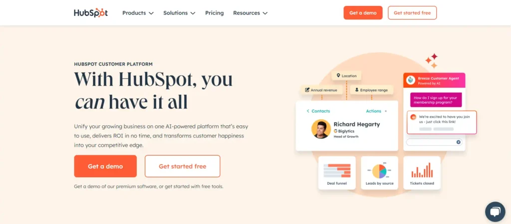
HubSpot revolutionized lead forms with their “smart forms” approach that automatically adapts based on what they already know about the visitor.
What makes them different: Their strategy isn’t based on a fixed number of fields, but on showing only the information they actually need. For new visitors, they might show up to 15 fields on desktop, but for returning users, the form dramatically shrinks.
The tricks that make them effective:
Results: Their smart forms increased mobile conversions by 500% by eliminating the friction of repeating information.
Practical application: If you have a CRM that stores data from previous visitors, program your forms to hide fields you already know. It’s the difference between looking smart or being annoying.
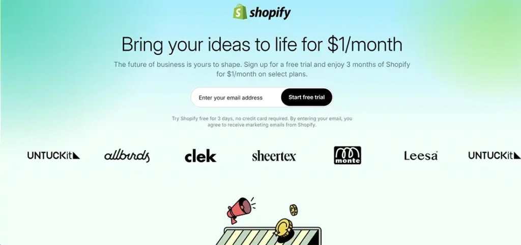
Shopify dominates e-commerce lead capture with forms that feel like natural conversations, not interrogations.
Their winning strategy: Instead of asking for everything at once, Shopify uses multi-step forms that start super simple: just email. Then they gradually ask for more information based on user actions.
Why it works:
The detail that makes the difference: Their CTAs speak in first person: “I want my free store” instead of “Get your free store.” This small psychological change increases conversions by 90%.
Key lesson: Users tolerate long forms if you break them into logical steps. The key is making each step feel like progress toward something valuable.

Netflix perfected the art of forms with incentives that offer instant gratification.
Their proven formula:
What makes them irresistible: Netflix eliminates all friction in the first contact. They only ask for email and immediately give you access to the complete catalog. Payment information comes later, when you’re already hooked on the content.
The psychological trick: Their copy doesn’t say “sign up” but “start watching.” You’re not selling the form, you’re selling the outcome.
Impressive numbers:
For your business: Offer immediate value before asking for commitment. A downloadable PDF, access to a calculator, or a free consultation work better than vague promises.
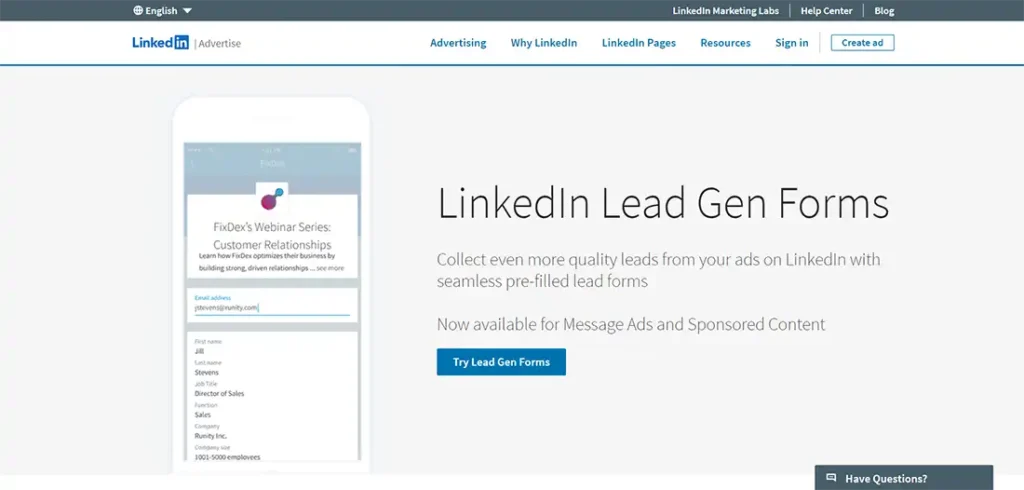
LinkedIn revolutionized B2B forms with their pre-filled form system that converts 277% better than Facebook or X.
Their competitive advantage: LinkedIn forms auto-complete with professional information that’s already in the user’s profile. You only need 3-4 fields because they already know the rest.
Typical winning setup:
Why they’re so effective: LinkedIn’s professional context makes users expect work-related forms. They don’t feel invasive because they’re in the right place, at the right time.
The secret to their success: LinkedIn allows you to download leads directly to CRM with enriched information: job title, company tenure, company size, etc. A 3-field form gives you information equivalent to 10+ traditional fields.
Data that matters:
Implement this: If you use LinkedIn Ads, always choose Lead Gen Forms over sending traffic to external landing pages. The friction of changing platforms kills conversions.
Creating high-converting lead generation forms requires smart design choices that focus on user experience. These proven strategies will help you build forms that capture more qualified leads while keeping visitors engaged on your website.

Lead generation forms work best with 5 to 10 fields. More fields scare people away. Fewer fields bring more leads. I’ve tested this rule across dozens of campaigns, and simple forms always win.
Short forms save time for visitors. People hate long forms that ask too many questions. A basic contact form with name, email, and phone number gets results. Add one or two specific fields if you need them.
Skip everything else. Test removing fields regularly to see what works. Your conversion rates will jump when you cut the fat from your web form.
Clear and personalized CTAs make the next step obvious for your visitors.
Simple forms work best, but your call-to-action button makes or breaks the conversion. First-person CTAs like “Tell me more” create stronger connections than generic phrases. SIMPLE HABIT uses this strategy to boost their lead generation forms by speaking directly to users.
Personalized CTAs perform better because they feel like conversations, not commands. ManyChat integration allows businesses to create these personal touches automatically. Companies see higher conversion rates when they replace “Submit” with “Get my free guide” or “Start my trial.” Your CTA button should tell users exactly what happens next, making the form experience clear and engaging.
A/B testing transforms your lead generation forms from guesswork into data-driven success. Test different elements like removing fields, changing formats, or altering CTAs to see what works best.
Tools like Unbounce simplify this process with built-in AI and A/B testing features that take the complexity out of optimization.
Your form performance improves dramatically when you test one element at a time. Change your headline, swap button colors, or reduce the number of fields you require. Track which version generates more leads and higher conversion rates, then implement the winning design across all your forms.
These four lead generation form examples show how simple changes boost your conversion rates dramatically. HubSpot’s clean design, Blume’s personalized CTAs, Daily Harvest’s smart incentives, and LinkedIn’s professional approach prove that great lead generation forms work across all industries.
Smart businesses use these proven strategies to capture qualified leads while creating smooth user experiences that visitors love. Tools like WPForms and OptinMonster make building effective forms simple, even for beginners who lack technical skills.
Start testing these approaches today because every form you optimize brings more potential customers into your sales workflow. Your next breakthrough in lead generation sits just one well-designed form away from reality.
Great lead generation forms use clear headlines, simple fields, and strong lead magnets to capture quality leads. The best form examples focus on one specific goal and remove distractions. Forms that offer valuable content like ebooks or free trials typically convert better than basic contact forms.
LinkedIn lead forms pre-fill user information automatically, making the process faster for prospects. These forms work well for business-to-business companies targeting professionals. LinkedIn forms typically generate higher-quality leads since users are already in a professional mindset.
Your form should ask for essential lead info only, like name and email. Add checkboxes for preferences and include a clear value proposition above the form. Keep forms short since longer forms often reduce conversion rates.
Real estate lead generation forms offering property valuations or market reports perform well. Quiz forms asking about home preferences also capture quality leads. These forms help agents gather specific buyer information while providing immediate value.
WordPress contact form plugins like Salesforce integrations help automate your workflow. Choose plugins that connect with your email system and track form performance. Most form builder tools offer templates you can customize for your specific business needs.
Don’t ask for too much information upfront since this reduces completions. Avoid placing forms at the bottom of pages where visitors might miss them. Never create forms without testing them first, and always include mobile-friendly designs for better results.