Maximize Conversions:
Create High Converting Multi-Step Forms in 5 Easy Steps
- Mike
Table of Contents
Are you looking to transform your website’s user experience and see a measurable uptick in your conversion rates? Consider the power of multi-step forms, a proven strategy that not only enhances user engagement but also streamlines the path to conversion. But what exactly makes them so effective, and more importantly, how do they create value for the user?
In this article, we delve into the intricacies of multi-step forms and their potent impact on conversion rates. We’ll provide you with insights and steps to build a high-converting form that enhances user satisfaction and contributes to your business’s success.
In case you haven’t heard, Stylish Cost Calculator is a proficient form builder and some of our forms have a 65% conversion rate. You read that right: more than half of the people who land on our clients’ forms convert. Talk about a high return on your effort!
What is a Multi-Step Form?
First thing first: What’s a multi-step form? And how is it different from a single-step form?
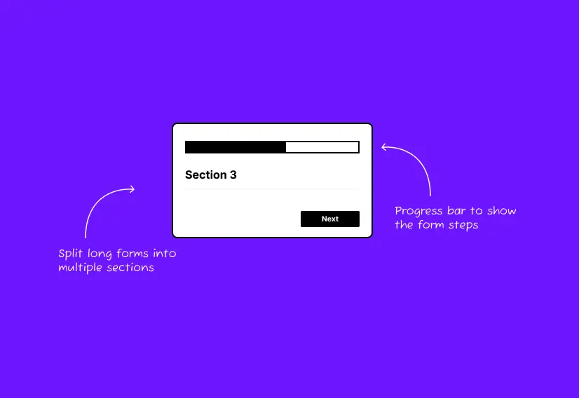
A multi-step form breaks down a lengthy form into smaller sections, making it less overwhelming for visitors to fill out. Each section focuses on a single set of questions. You might move through those multiple steps one at a time. Additional fields are revealed progressively, appearing only after visitors have provided their basic information, such as their name and email address. View how a multi-step form works:
On the other hand, a single-step form is all on one page, and you answer all the questions at once. You don’t have to click on any “next” buttons or go to different pages.

Why Use Multi-Step Forms? Some Facts, Statistics, and Case Studies
Multi-step forms have an edge over single-step forms. They make the user experience better by lessening fear and guiding users step by step. Let’s look at some real examples to see how true this is.
The following case studies prove the point:
- GoodUI compared a multi-step form with a single-page form for Obama’s campaign. The multi-step form led to a 5% increase in revenue.
- In a recent A/B test, Blackbaud examined the performance of a single-page donation form versus a multi-step variant. The results revealed significant advantages for the multi-step approach, including:
- A 33% increase in total conversions.
- A 75% higher form conversion rate, measured as conversions per visit.
- A 90% surge in overall donations.
- A 54% boost in average donation amounts.
- Vendio specializes in website creation. They compared the performance difference between a single-page form and a multi-step form. Their multi-step form resulted in a 214% increase in lead generation.
- BrokerNotes, which works in B2C financial lead generation, saw big changes. By using multi-step forms, their conversion rates went from 11% to an impressive 46%.
Inspired by the success stories? It’s your turn to experience the difference. Stylish Cost Calculator offers a seamless way to integrate multi-step forms into your website, ensuring your users enjoy a simplified, engaging form-filling process just like Labrosse Real Estate did.
Case Study - How Labrosse Real Estate Improved Conversion and User Satisfaction with a Tailored Multi-Step Rental Property Calculator
Background
Labrosse Real Estate, a leading real estate agency in Ottawa, sought to improve its website's user engagement and conversion rates. They aimed to provide potential investors with a tool to easily calculate the returns on rental property investments. The challenge was to present complex calculations in an accessible manner to users with varying levels of investment knowledge.
Solution
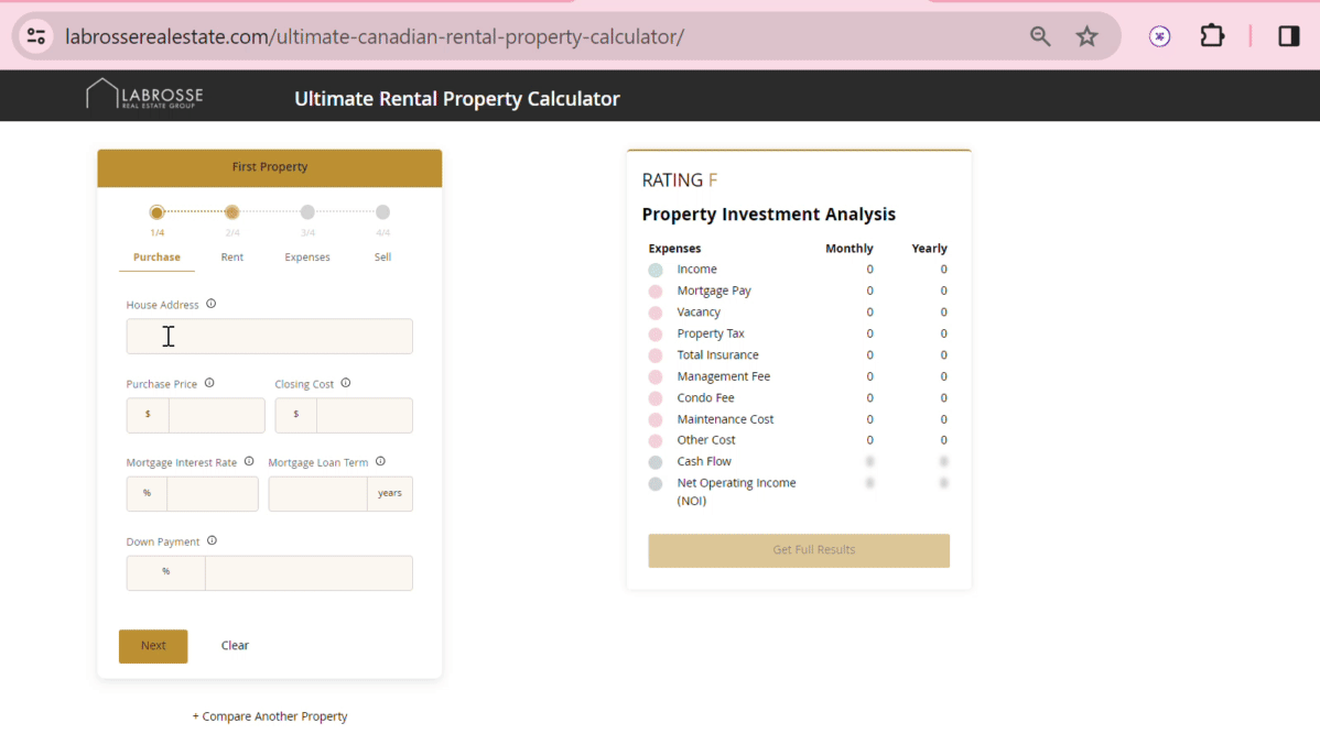
Labrosse Real Estate installed the Stylish Cost Calculator, utilizing a template specifically designed for real estate investment calculations. The multi-step form guided users through a series of inputs, such as property price, rental income, expenses, and financing details, breaking down the complex process into manageable steps.
1. Increased Engagement
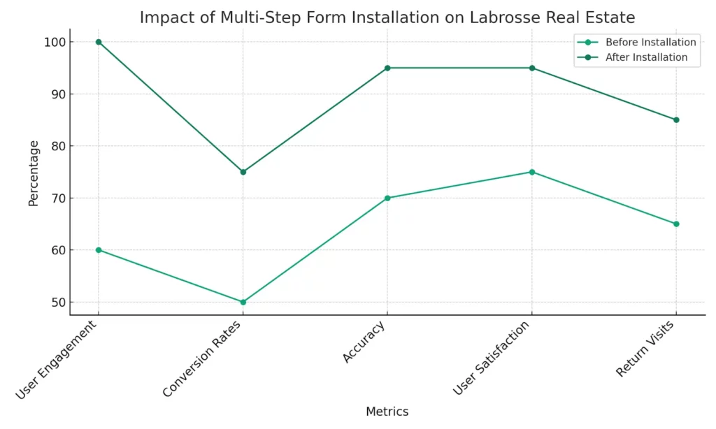
The intuitive design of the multi-step form led to a 40% increase in user engagement on the calculator page, indicating that users found the process more interactive and engaging.
2. Higher Conversion Rates
The clear, step-by-step process significantly reduced form abandonment rates, resulting in a 25% increase in conversion rates for inquiries and consultations, demonstrating the form's effectiveness in capturing user interest and converting it into actionable leads.
3. Improved Accuracy
The structured input process reduced user errors in data entry, leading to more accurate calculations and satisfied users, which is crucial for building trust and credibility in the real estate investment sector.
4. Enhanced User Satisfaction
Surveys indicated a notable improvement in user satisfaction, with feedback praising the calculator's ease of use and the streamlined experience provided by the multi-step form.
5. Greater Insights into User Behavior
The implementation of the multi-step form allowed Labrosse Real Estate to gather detailed analytics on how users interact with the calculator, offering valuable insights into user preferences and behaviour.
6. Increased Return Visits
The user-friendly and informative nature of the calculator led to a higher rate of return visits to the website, suggesting that users viewed the tool as a reliable resource for their investment calculations.
7. Positive Feedback Loop
The positive user experience encouraged users to share the calculator with peers, resulting in increased word-of-mouth referrals and further enhancing Labrosse Real Estate's market presence.
Why Use Multi-Step Forms? Some Facts, Statistics, and Case Studies
1. Boosting Conversions with Multi-Step Forms
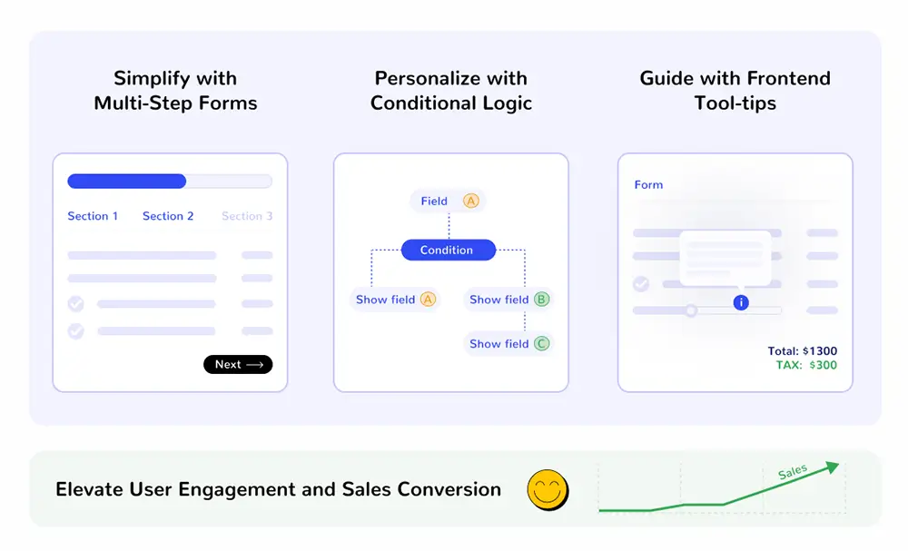
Streamlining the form-filling experience with a well-organized, step-by-step layout reduces the risk of user fatigue. This thoughtful design leads to an uptick in form completion rates. Conversely, extensive forms that seem to scroll endlessly often drive users away before they've hit 'submit'. To counter this, the Stylish Cost Calculator enables the creation of multi-step forms, offering a user-friendly route to higher conversions.
2. Better Engagement
Faced with a lengthy form, users can feel swamped and disengaged—a reaction no business wants. Multi-step forms cut through this issue by breaking information into small, digestible pieces, thereby boosting user satisfaction.
3. Mobile Optimization
Imagine trying to pack a suitcase without dividers; it's chaotic. That's the experience of tackling a long form on a mobile device. Multi-step forms change the game by acting like packing cubes, separating categories for easy, orderly access. This approach reduces mental effort, allowing users to concentrate on one section at a time, perfect for the limited space on mobile screens.
4. Aesthetic and Functional Design
Cluttered forms don't match the sleek, minimalist design that modern users like. The Stylish Cost Calculator creates forms differently. These forms have clean lines and a lot of white space. They look good and draw users in. They also keep users' attention.
5. Accessibility for All
Multi-step forms help a lot of people. This includes those with cognitive challenges or those not great with technology. These forms break down questions into smaller, easier pieces. This makes filling out forms less scary and more friendly for everyone.
6. Enhanced Personalization Through Conditional Logic
Forms that change based on what you enter are more personal. Multi-step forms use something called conditional logic. This means the questions you see next depend on what you answered before. This makes the experience feel tailor-made for each user. It's more interesting and relevant. This kind of interaction is not just more enjoyable. It also makes the information collected more accurate. This leads to happier users and a higher chance that they'll finish the form.
- Sell your products & serices with complex math
- Send quotes by email to collect leads
- Enable your customers to configure your products & services
When to Use Single-Step or Multi-Step Forms?
Single-step forms are ideally used for straightforward data collection tasks. They are most effective when the information needed is minimal and uncomplicated, such as a quick contact form or a newsletter subscription.
The simplicity of a single-step form, where all fields are presented on one page, ensures that users can quickly complete their submissions without navigating through multiple sections. This can lead to a higher completion rate for simple tasks where the user’s time and effort are key considerations.
On the other hand, multi-step forms are better suited for more complex interactions where diverse types of data are collected. For instance, in a detailed job application or a comprehensive medical history form, multi-step forms can organize the information into logical segments, reducing the user’s cognitive load at each step.
This not only helps keep the user from feeling overwhelmed but also allows for a more focused and accurate data-collection process, as users are not bombarded with too many questions at once.
How to Create a Multi-Step Form in WordPress with the Stylish Cost Calculator?
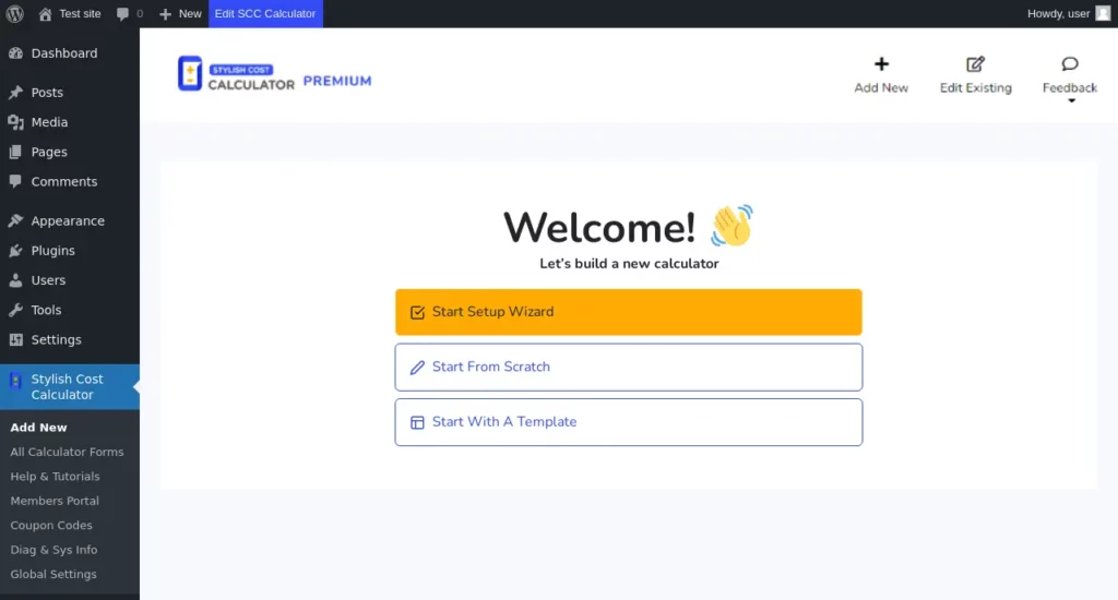
Step 1
Create a winning landing page. Download the premium version of the Stylish Cost Calculator plugin. Click Add New.
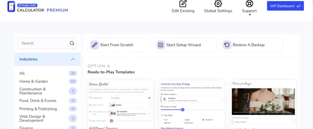
Step 2
You can customize an existing template or create a form from scratch.
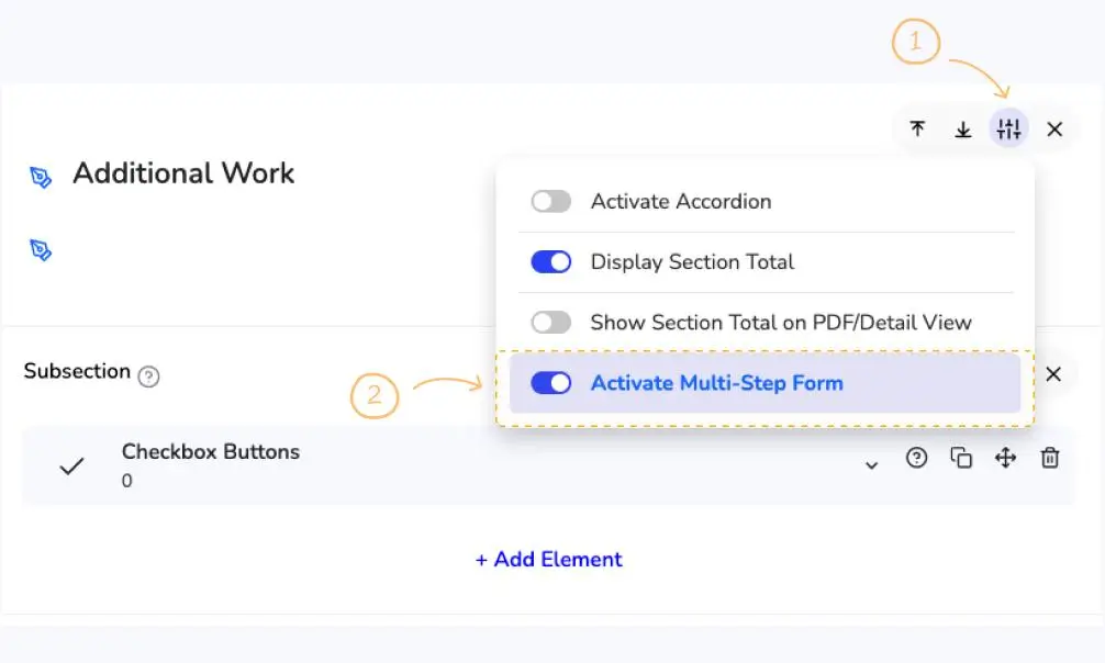
Step 3
Activate the multi-step feature by accessing the settings icon in the calculator builder. Click on "Activate Multi Step" to initiate the process.
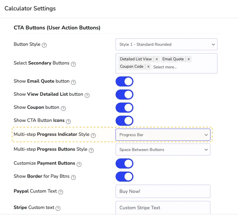
Step 4
The next step is to click on the multi-step progress indicator style, once you click on it, three options are available.
a. Progress Bar Steps With Title
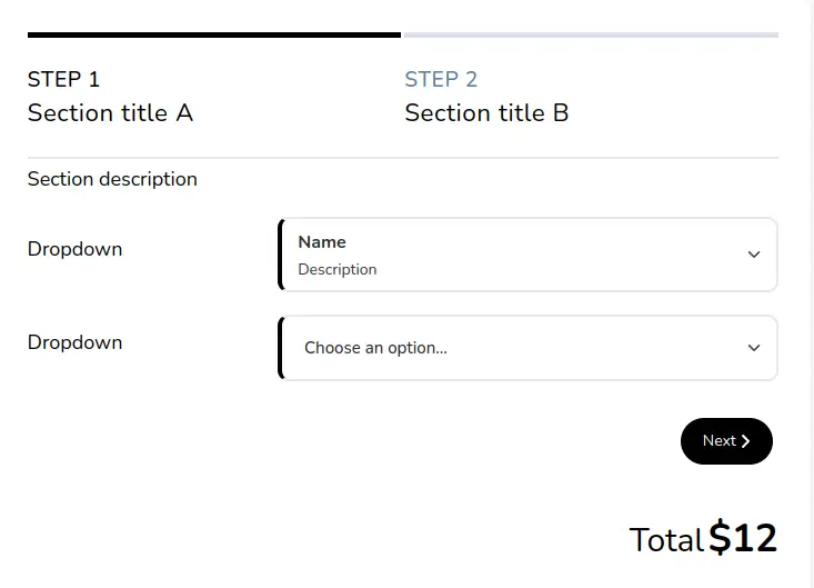
If you select the section of progress dots with the title, it will look like this:
b. Progress Dots With Title
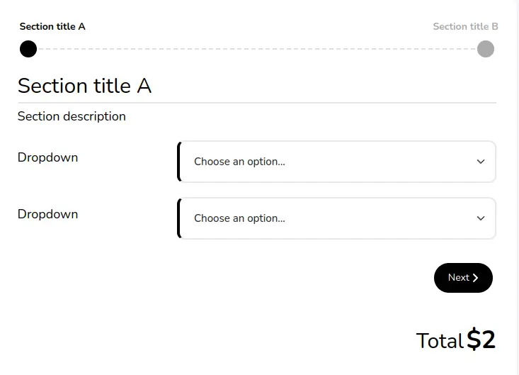
c. Progress Bar

Step 5
Visualize the selected style to ensure it aligns with your website's aesthetics and user experience goals. Grab the short code and paste it on your web page.
3 Killer Multi-Step Forms Created Using Stylish Cost Calculator
If you’re looking for some multi-page form inspiration, check out this roundup of multi-step form examples.
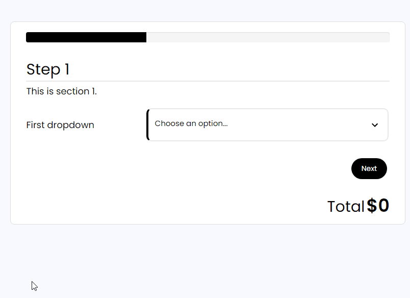
1. Web Developer Registration Form
This is a 4-step sign-up form featuring a sleek design and multiple pages. Each of the steps shows only 2 to 3 fields. The progress bar informs the users about how much progress they have made. The form integrates images, sliders, and drop-down menus without cluttering text.
2. T-shirt Printing Multi-Step Form
This is a great form example: a simple yet very effective multistep form guides users through the custom T-shirt printing process. The form is divided into three clear steps, which help the users understand where they are in the process and what is expected of them. Each step contains only the necessary field, avoiding information overload. The clean interface in this form example, with plenty of white space, enhances readability and interaction in the multistep form.
The form employs a visually appealing colour scheme with playful icons that make the experience more engaging compared to plain text fields. The design maintains consistency throughout the steps, with a persistent colour theme and layout structure, giving users a sense of familiarity as they progress.
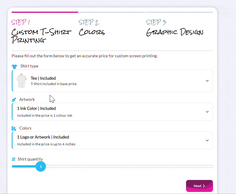
A persistent colour theme and layout structure, giving users a sense of familiarity as they progress.
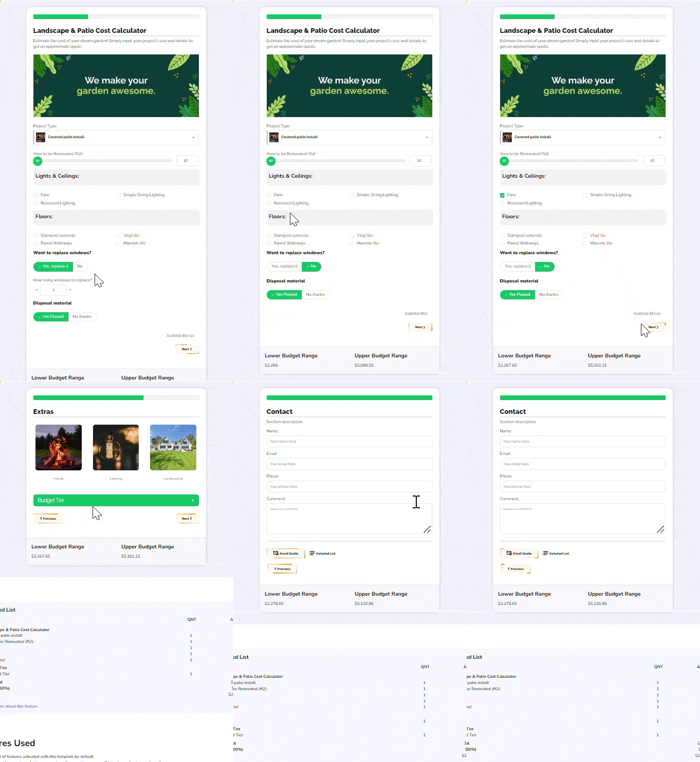
3. Landscape and Patio Cost Calculator
The multi-step form displayed shows a thoughtful approach to user experience by breaking down the estimation process into digestible segments. This allows users to input a variety of information without feeling overwhelmed.
The design is clean and user-friendly, featuring intuitive selections like dropdowns, toggles, and checkboxes that cater to different input types, facilitating smoother navigation through the cost calculation journey. This thoughtful structuring undoubtedly enhances user engagement and the accuracy of the data collected.
Best Practices For Creating Multi-Step Forms
This Reddit thread lists some excellent ideas for creating the best multi-step form. We have summarized the ideas from the experts over here:
- Break Down the Form: Divide the form into clear, manageable sections that guide the user logically through the process.
- Progress Indicators: Use progress bars or step numbers to show users how far they've come and how much is left.
- Save Progress: Allow users to save their progress, particularly in longer multistep form templates.
- Conditional Logic: Implement conditional logic to keep the form relevant to the user, minimizing unnecessary form fields.
- Responsive Design: Ensure that your multistep form is responsive and functions well across different devices and screen sizes.
- Clear Navigation: Provide intuitive navigation options, such as the 'Next' and 'Back' buttons, and ensure that navigating doesn't cause data loss.
- Input Validation: Validate user input in real-time and provide helpful error messages to correct any issues before proceeding.
- Final Review: Give users the opportunity to review their inputs before final submission.
Conclusion
In conclusion, multi-step forms offer a strategic approach to form design, enhancing user engagement and conversion rates across various industries. By activating the multi-step feature with Stylish Cost Calculator, you can create an intuitive user interface and optimize the form completion process.
FAQs
Increased conversion rates signify higher profitability and reduced marketing expenses, achieved through efficient lead generation and sales processes.
Yes, multi-step forms have been shown to have an 86% higher conversion rate compared to long single-step forms, owing to their user-friendly design and segmented approach.
Multi-step forms break down complex processes into manageable steps, improving user experience and engagement while facilitating data collection. You can easily create a multi-step form with the help of a plugin like Stylish Cost Calculator. The form builder creates structured forms with multiple steps for a clear, intuitive user experience.
Long forms overwhelm users with extensive fields, leading to higher abandonment rates. In contrast, multi-step forms segment information by splitting long forms. This results in a streamlined completion process and improved conversion rates.
