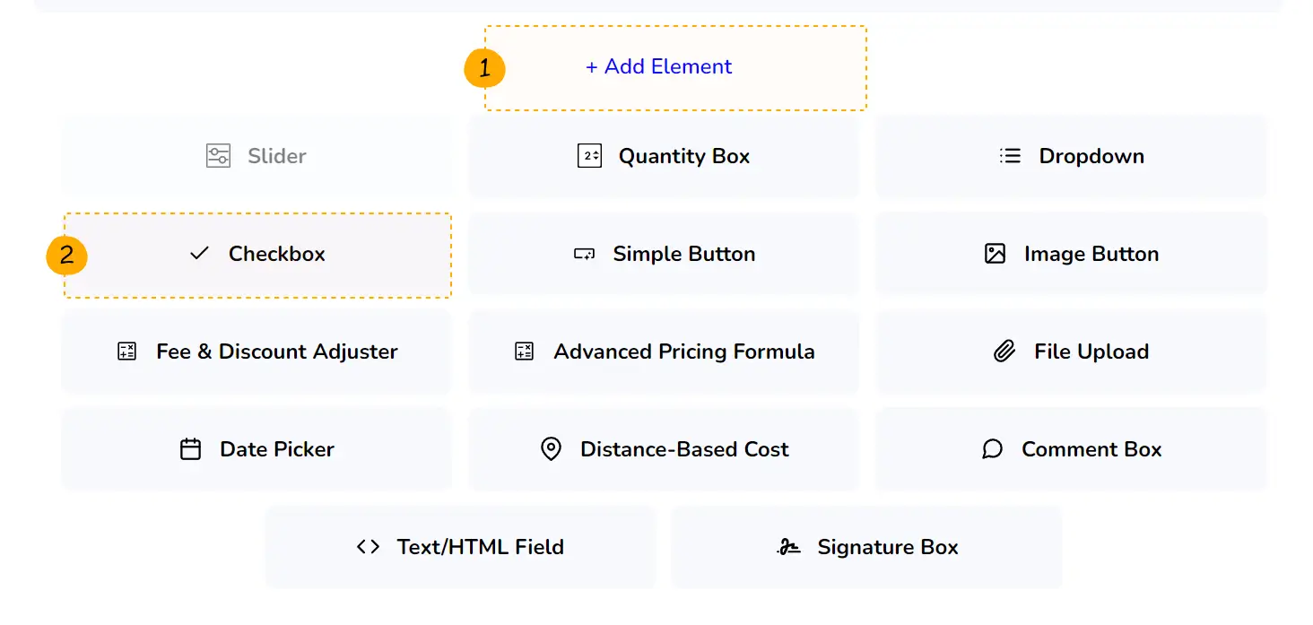
Checkbox, Toggle Switches & Simple Buttons
Introduction
Checkboxes, Toggle Switches and Simple Buttons are elements that we are all very familiar with and in Stylish Cost Calculator they work exactly the same way as you would expect them to work.
Table of Contents
Use Cases
Checkbox Use Cases
-
1Let your customer accept or decline terms and conditions.
-
2Let your customers add variants or additional features to their services.
Toggle Switches
-
1Let your customers enable or disable settings within your form. You can use it to replace 2 radio buttons or a checkbox.
-
2Use it for yes/no or on/off conditions.
Simple Buttons
-
1Use it to add or activate additional features.
- Buttons have 2 states: default and pressed.
How to Activate & Use This Feature
Settings & Options
Step 1.
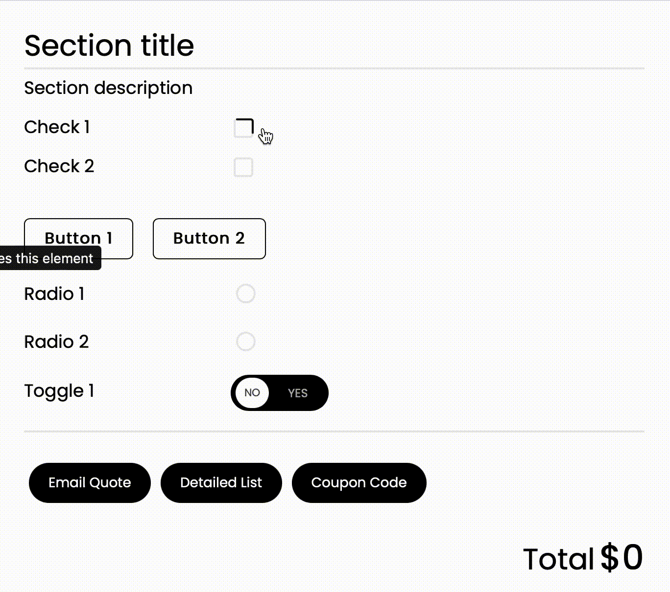
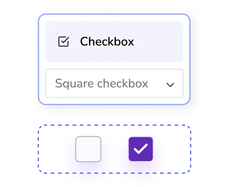
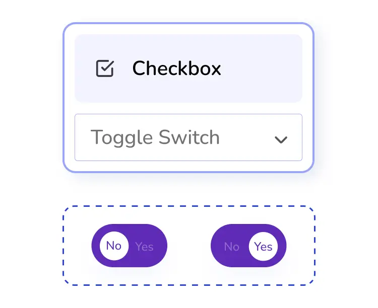
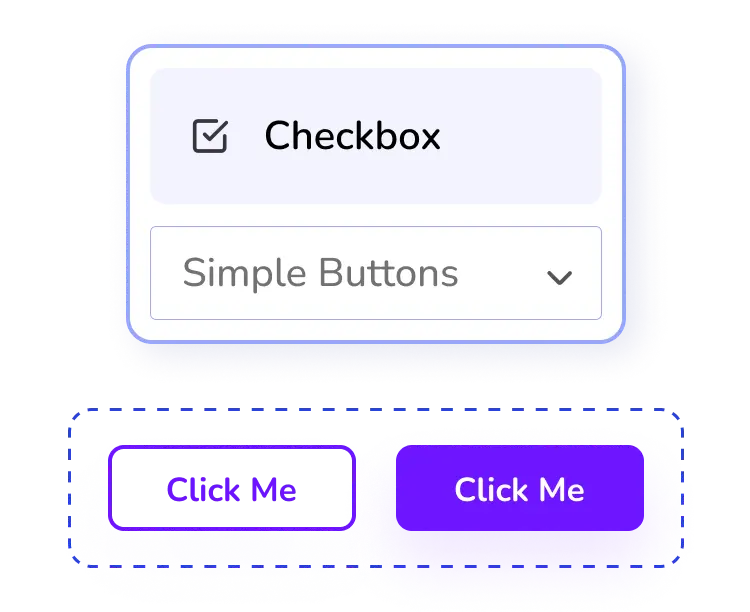
To add simple buttons, toggles, switches and radio buttons, click on the "+ Add Element" button Then, click on "Checkbox"
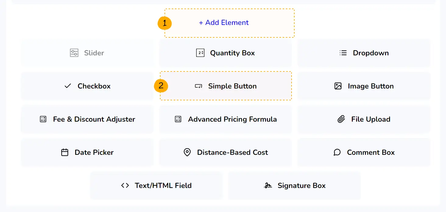
Step 2.
Or click on "Simple Button"
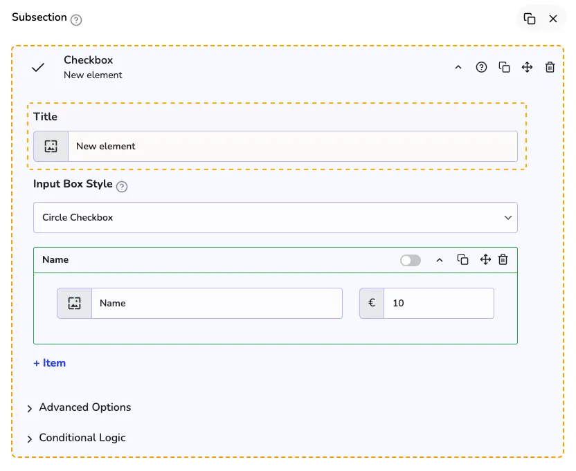
Settings & Options
Title
You might want to setup a Title, just for internal reference. This will help you identify your elements, when creating large forms.
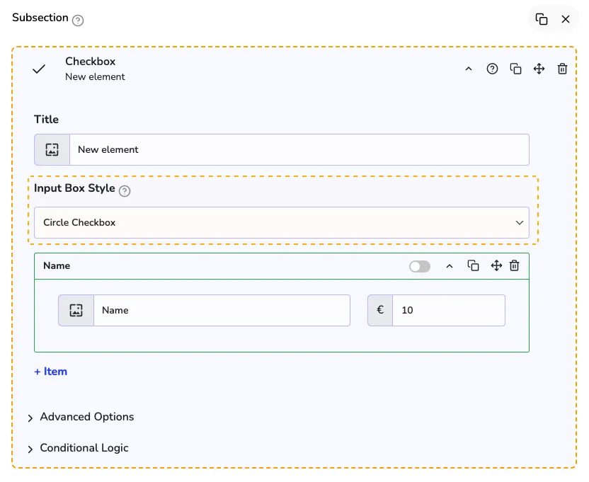
Input Box Style
With the "Input Box Style" you can change the element appearance and element type
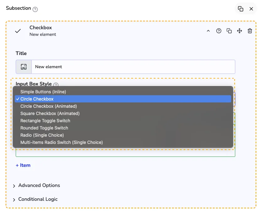
All the options
We recommend you to explore all the options to find an element that better fit your needs.
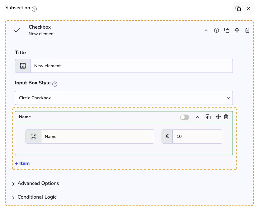
Edit and/or add items
Here you can edit and/or add more items.
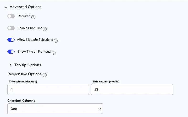
Advanced options
With the advanced options, you can make this element mandatory, enable a price hint for customers to live preview the price, the responsive options and you can also set a number of columns for the checkbox elements.
Additional Information
Limitations
-
1Circle & Square Checkboxes - more than one is allowed ✅
-
2Simple Buttons - more than one option is allowed ✅
-
3Toggle Switches - more than one option is allowed ✅
-
4Radio Buttons - only one option is allowed ✅
-
5Image Buttons - more than one option is allowed ✅