Multi-step Form

A complete guide
Multi step form

Table of Contents

multi step gif

Feature Description

Would you like to split your form into multiple steps? With a multi-step calculator form (multi-page form) you can break long forms into smaller sections, improving user experience and making them less overwhelming.

It's different than conditional logic that shows/hides elements one at a time. With a multi-page form, you use the next button to progress the user down the journey of completing the form.

Benefits, Features & Use Cases

How It Works

How to Activate & Use This Feature

activate the multi step

Step 1. Click on the settings icon

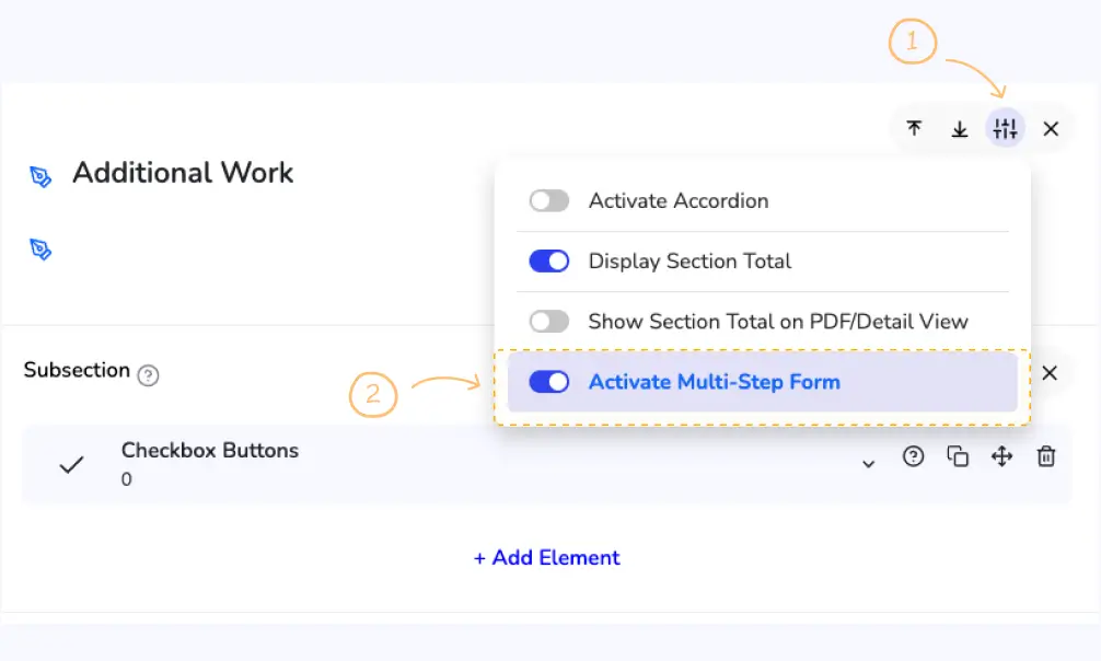
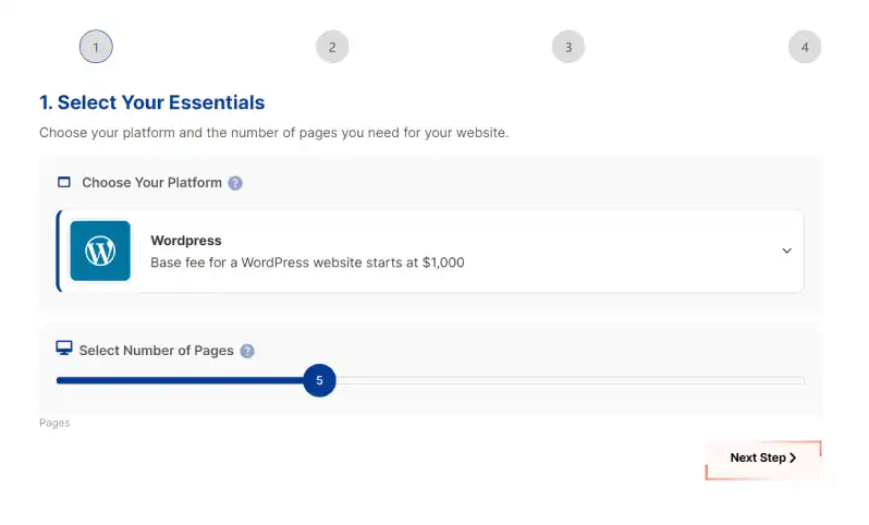
To activate the multi-step, first click on the settings icon, on the top right section of the calculator builder. Then, click on the "Activate Multi-step" switch to turn it on.

👉 Note: You can only activate multi-step forms on the second, third, and later sections. You cannot activate it on the first section as it’s shown by default

Settings & Options

progress bar multistep

1. Multi-step Progress Indicator Style

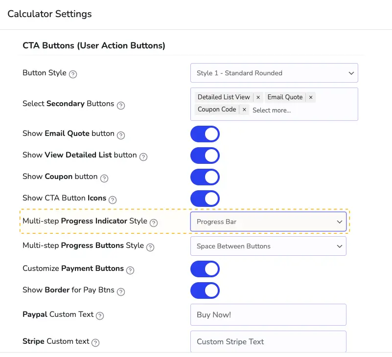
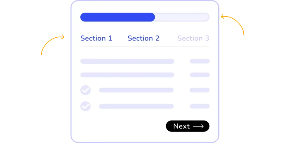
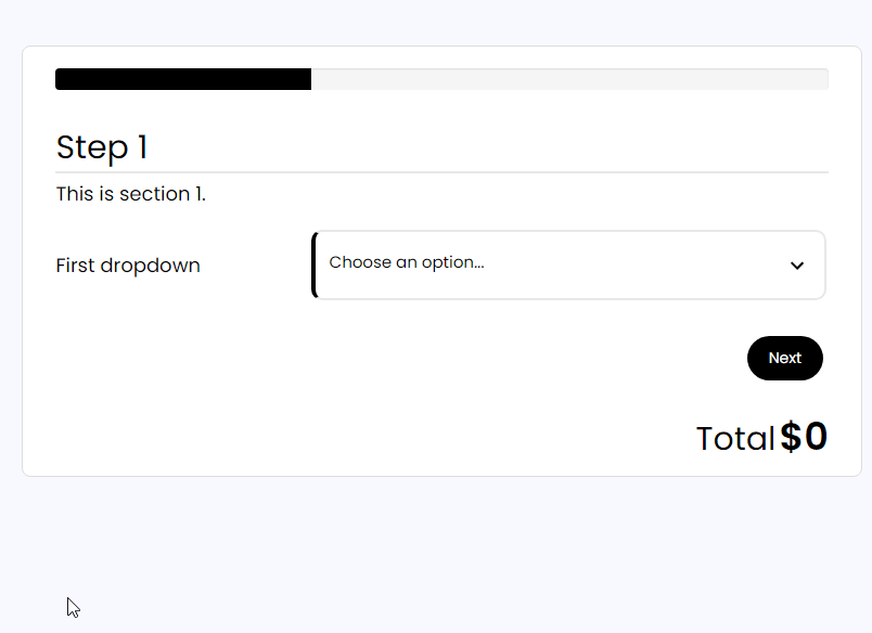
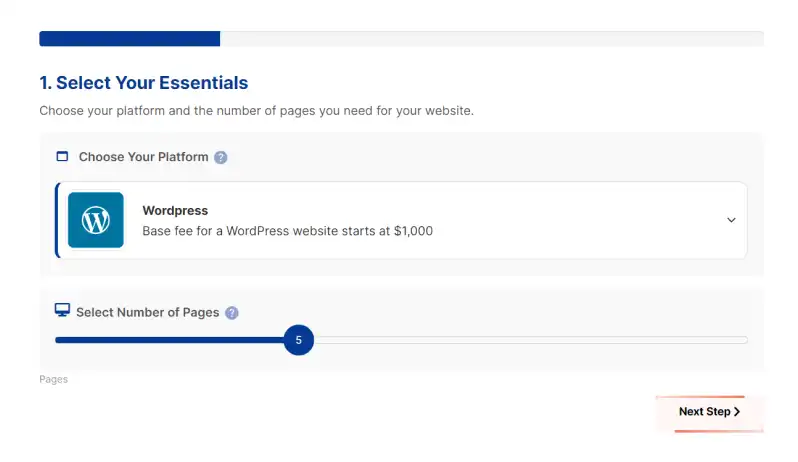
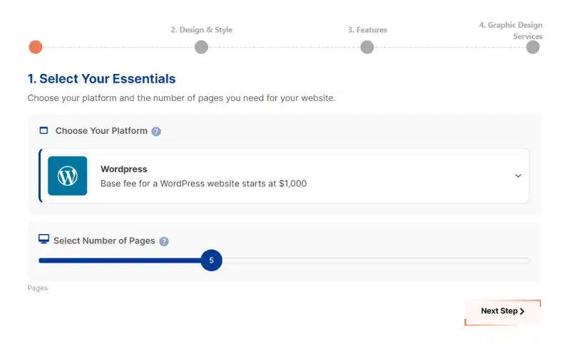
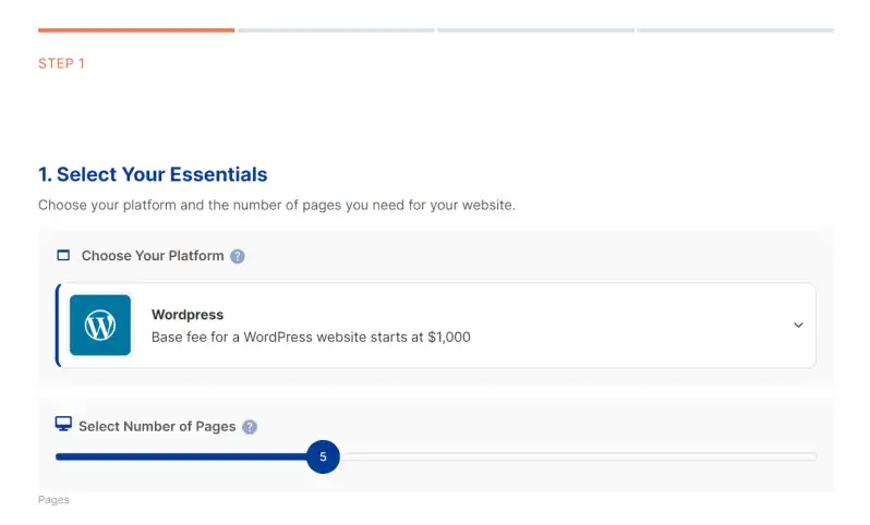
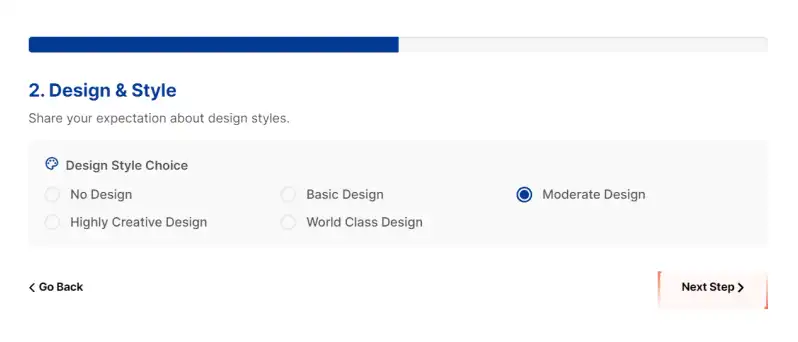
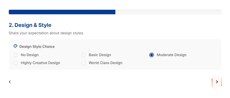
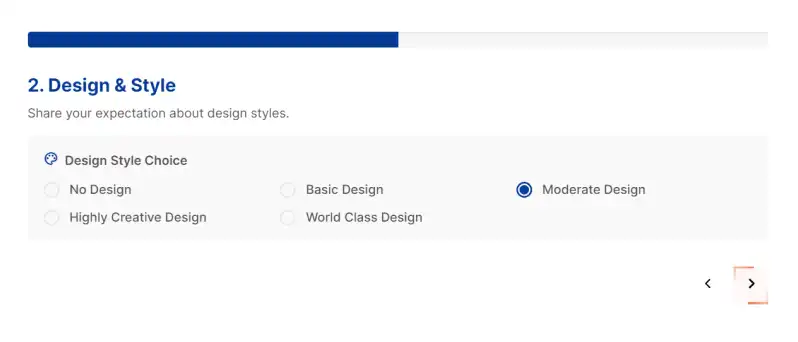
You can choose between Progress Bar, Progress Dots With Title, Progress Bar Steps With Title, Progress Dots with Numerical Steps or no progress bar.

If you select Progress Dots With Title, a new option will appear that allows you to configure the mobile view. Enable it if you want only the text for the current step to appear, rather than all steps, on mobile devices.

Only show Active Step in Mobile View
Multi step progress buttons style

2. Multi-step Progress Buttons Style

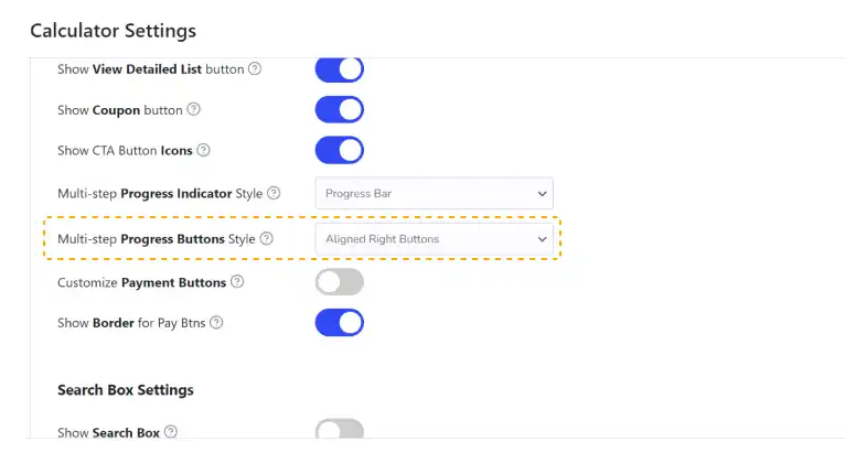
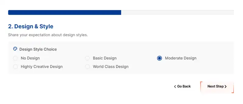
You can choose between Space Between Buttons, Space Between Buttons (Only arrows in the text), Aligned Right Buttons and Aligned Right Buttons (Only arrows in the text)

Frontend Options
(What It Looks Like)

Progress Indicator Styles

progress bar multi step
Progress Bar

1. Progress Bar

Progress Dots With Title

2. Progress Dots With Title

Progress Bar Steps With Title

3. Progress Bar Steps With Title

Progress Dots with Numerical Steps

4. Progress Dots with Numerical Steps

Progress Buttons Styles

Space Between Buttons

1. Space Between Buttons

Space Between Buttons (Only arrows in the text)

2. Space Between Buttons
(Only arrows in the text)

Aligned Right Buttons

3. Aligned Right Buttons

Aligned Right Buttons (Only arrows in the text)

4. Aligned Right Buttons
(Only arrows in the text)

SCC logo White
Don't miss a powerful feature! 👇